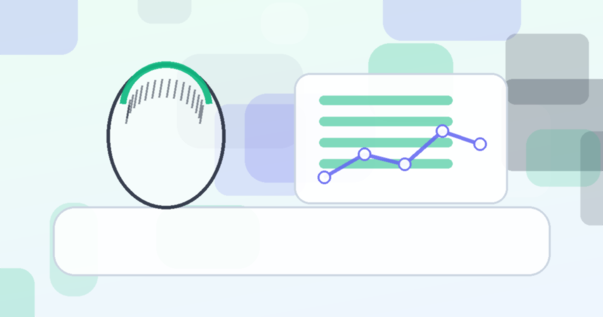
Visual data presentation increases patient understanding of clinical information by 60% compared to numerical tables alone. myhairline.ai converts your raw density readings into four distinct visualizations, each designed to answer a different question about your hair health.
The Four Visualization Types
1. Density Heatmap
The density heatmap is your scalp overview. It maps a color gradient onto a top-down scalp diagram, showing density levels across every region in a single image.
How to read it:
| Color | Density Level | Meaning |
|---|---|---|
| Deep Blue | Very Low (below 100 FU/cm2) | Significant thinning, priority treatment area |
| Light Blue | Low (100 to 140 FU/cm2) | Below average, monitor closely |
| Green | Normal (140 to 200 FU/cm2) | Healthy range for most ethnicities |
| Yellow | Above Average (200 to 230 FU/cm2) | Strong density |
| Red | High (above 230 FU/cm2) | Excellent density |
The heatmap is most powerful when compared across time. Place your month 1 heatmap next to your month 6 heatmap and look for color shifts. Blue zones turning green mean density is recovering. Green zones turning blue mean loss is progressing.
Step 1: Access Your Heatmap
Open your myhairline.ai dashboard and select "Density Map" from the visualization menu. Your most recent scan generates the default view.
Step 2: Enable Time Comparison
Tap "Compare" and select a previous scan date. The app displays both heatmaps side by side with a difference overlay highlighting zones that changed.
Step 3: Focus on Transition Zones
The most actionable information lives at the boundaries where colors shift. A zone transitioning from green to light blue is an early warning. A zone shifting from light blue to green is early evidence of treatment response.
2. Trend Line Chart
The trend line chart answers the question: "Is my density going up, down, or staying flat over time?"
Each scalp zone gets its own line, plotted against time on the x-axis and density (FU/cm2) on the y-axis. You can toggle zones on and off to focus on specific areas.
Reading the slope:
- A rising slope means treatment is producing regrowth. Finasteride achieves regrowth in 65% of users.
- A flat slope means treatment is stabilizing your loss. This is a positive outcome for 80-90% of finasteride users.
- A declining slope means current treatment is insufficient.
Handling noise: Individual data points may jump around due to hair cycling, seasonal shedding, or minor photo angle differences. The trend line smooths this noise. Always focus on the 3 to 6 month trend, not month-to-month changes.
Step 4: Customize Your View
Filter the trend line by zone, time range, or treatment period. Marking treatment start dates on the chart helps you visually correlate when a treatment began with when density changes appeared.
3. Zone Bar Chart
The zone bar chart displays current density values for each scalp region as vertical bars, making zone-to-zone comparison immediate and intuitive.
| Zone | Typical Range (Caucasian) | Treatment Response |
|---|---|---|
| Frontal | 150 to 200 FU/cm2 | Moderate (minoxidil helps most) |
| Mid-scalp | 160 to 210 FU/cm2 | Good |
| Vertex | 140 to 200 FU/cm2 | Strong (responds well to finasteride) |
| Temporal | 170 to 230 FU/cm2 | Resistant to loss, stable reference |
Step 5: Compare Current to Baseline
Toggle the "Show Baseline" option to overlay your initial density readings behind the current bars. The gap between baseline and current tells you exactly how much each zone has changed.
A narrow or positive gap means your treatment is working. A widening gap means loss is outpacing treatment in that zone.
4. Period Comparison Overlay
This visualization answers: "How did I respond in the first 6 months versus the last 6 months?" It overlays two time periods on the same chart, letting you compare treatment phases.
This is particularly useful when:
- You switched treatments and want to compare response rates
- You added a treatment (like PRP at $500 to $2,000 per session) to your existing regimen
- You want to see if seasonal patterns affect your density
Step 6: Set Your Comparison Periods
Select two date ranges from the period picker. The overlay chart shows both trend lines with shading to highlight the difference between them.
Putting It All Together
Each visualization serves a specific purpose. Here is when to use each one.
| Question | Best Visualization |
|---|---|
| "Where am I thinning?" | Density Heatmap |
| "Is my treatment working over time?" | Trend Line Chart |
| "Which zone responds best?" | Zone Bar Chart |
| "Was treatment A better than treatment B?" | Period Comparison Overlay |
For a plain-language explanation of what each metric means, read the data interpretation guide. For a deeper understanding of density measurements, see understanding hair density.
Make Your Data Visual
Numbers tell part of the story. Visualizations tell the rest. Start building your visual tracking history today at myhairline.ai/analyze and turn raw density data into clear, actionable insight.
Medical disclaimer: This article is for informational purposes only and does not constitute medical advice. Consult a healthcare professional for personalized treatment recommendations.